Trajectory multi-color plot
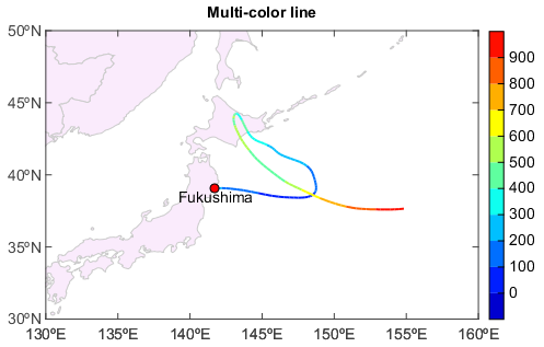
Below is an example to plot a multi-color trajectory according to it’s height. Read longitude, latitude and height arrays from a HYSPLIT output trajectory file, and plot multi-color trajectory in a map.
#Read trajectory data file
fn = 'D:/Temp/HYSPLIT/05060306'
f = addfile_hytraj(fn)
lon = f['lon'][0,:]
lat = f['lat'][0,:]
alt = f['height'][0,:]

#Plot
axesm()
geoshow('country', edgecolor=(204,204,204), facecolor=(250,235,252))
levs = arange(0, 1000, 100)
cols = makecolors(len(levs) + 1)
gg = plot(lon, lat, zvalues=alt, levels=levs, colors=cols, size=2)
scatter(lon[0], lat[0], size=8, facecolor='r')
text(lon[0], lat[0]-1.5, 'Fukushima', xalign='center')
colorbar(gg)
title('Multi-color line')
yticks(arange(30, 51, 5))
xlim(130, 160)
ylim(30, 50)